There’s a naturally symbiotic relationship between data and design. It’s at the meeting of the two where effective, impactful communication is born, which is why the partnership between Assette and Emerson Ward, announced earlier today is such a natural fit.
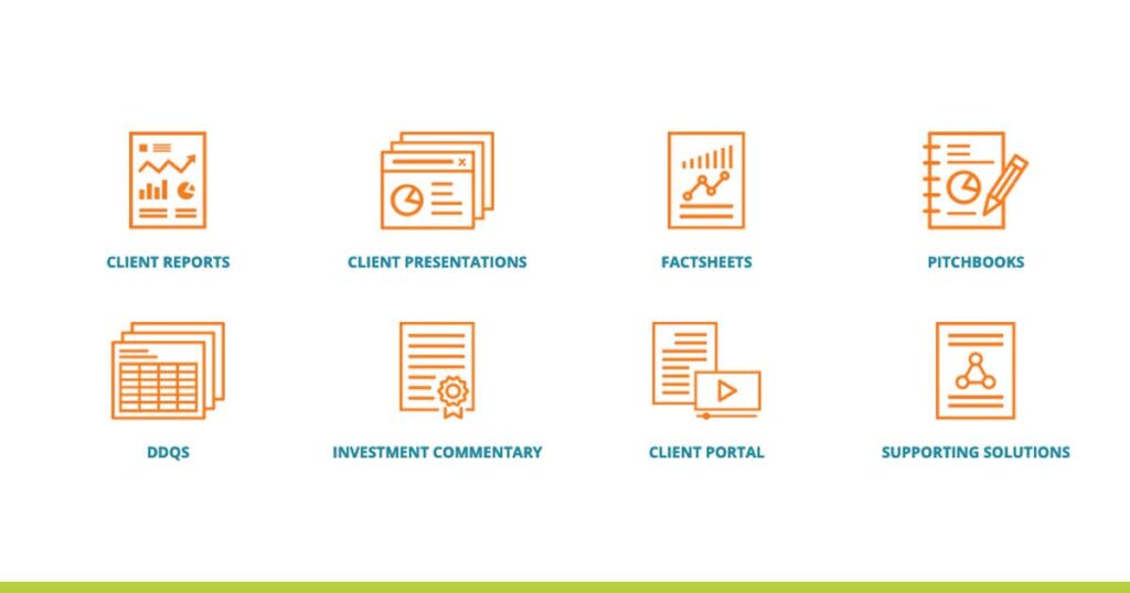
Assette is an established fintech provider and leader in data automation services for asset managers. From client reports to portals, factsheets and pitchbooks, Assette understands that how a firm’s communications look and perform can be a significant competitive advantage to winning and retaining clients.
Asset Management firms expend significant energy and resources to produce accurate, consistent data, and distribute it across their network. But making sure their message hits its target requires more than just updated performance numbers. Trusted data turns into timely insights through good design. Well-designed collateral can help cut through the noise, direct the reader’s eye, and deliver powerful stories that resonate with clients. Edward Tufte, one of the world’s leading authorities on the visual display of quantitative information, and professor emeritus of political science, statistics, and computer science at Yale University put it plainly: “Clutter and confusion are failures of design, not attributes of information.”
From eye catching charts that grab the reader’s attention to reports that are so jumbled with data it’s hard to know where to start reading – we’ve seen it all at Emerson Ward. So, to celebrate our new partnership, we wanted to share a few quick design insights that can help improve your communications:
- Think accessibility first
- This may seem like a simple tip, but it is critical that when designing you always keep accessibility at the forefront, especially when designing for the web. From screen reader performance to links that describe the destination and color contrasts, you want to ensure as many people as possible can access your content.
- Less is more
- Does it seem like attention spans are getting shorter and shorter? It’s not just you. In the nearly 20 years we’ve been in the industry, we’ve seen the average number of slides in a standard pitch book drop from around 30 to a much more succinct 16-20 slides today.
This “less is more” approach should be a significant focus for marketers and designers alike. We strongly suggest resisting the urge to overload your slides, web pages, and other materials with too much information, but we understand it’s often a necessary evil in this industry. Good design will help highlight key information, lead the reader through content, provide clarity, and let your story shine. Through a minimalist approach, it’s no longer about putting all the content on a page; It’s about resisting that urge, focusing on just the most vital information, and then giving readers time to digest it all.
- Does it seem like attention spans are getting shorter and shorter? It’s not just you. In the nearly 20 years we’ve been in the industry, we’ve seen the average number of slides in a standard pitch book drop from around 30 to a much more succinct 16-20 slides today.
- Consistency, consistency, consistency
- Whether you’re building a website or designing a pitch book, keeping readers engaged and informed is job number one. The goal of the designer is to remove as many barriers to information as possible; to ensure that the reader’s experience is frictionless. Inconsistent layouts, page titles that are out of sync, charts and tables that look different from page-to-page, can distract the reader, and make it more difficult to consume information. For pitchbooks, make sure you’re setting up master layouts, using grids to keep information aligned, and maintaining a consistent look throughout. For websites, take the time to understand the user and their experience on the site, while adhering to the same principles above. And for all materials, both internal and client-facing, if you’re firm has brand guidelines, stick to them!
Interested in learning more? Reach out (Brian@em-ward.com) and let’s chat about how Emerson Ward and Assette can help build your brand, tell your story, and improve your communications.
About the Author
Brian Ward is the Founder & Creative Director at Emerson Ward, a creative agency focused exclusively on providing custom, professional web, design, and content solutions to the asset management and fintech ecosystem. He’s an experienced brand builder, designer and communications expert who’s worked with financial service firms of all shapes and sizes over the course of his career, helping startups, service providers, large publicly traded firms, and global multi-nationals build their brand, expand their communications, and grow their marketing capabilities.


